Monday, June 9, 2014

Final Portfolio

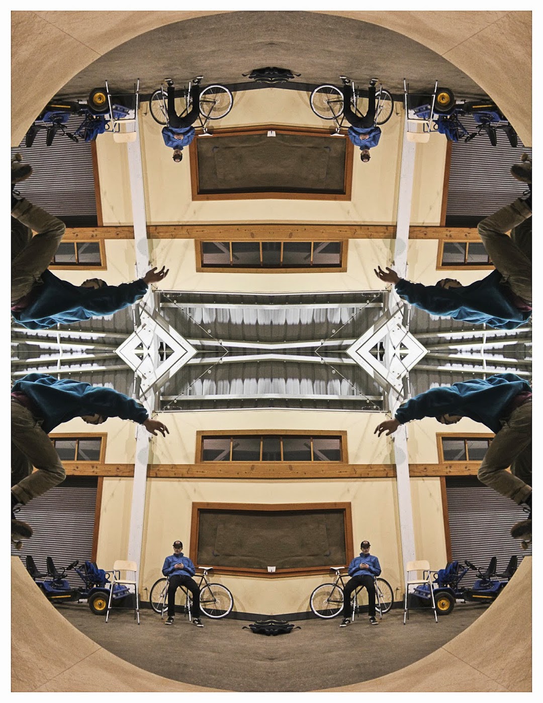
I had a great year in digital imaging. I learned a lot about what goes into taking a good photo. At the beginning of the year, I took a lot of photos of the city, as well as nature. Towards the end of the year, I shifted to shooting more photos of my friends skateboarding, as well as some portraits of them. I am looking forward to expanding my photography skills next year. Here is my final portfolio slideshow.

Tuesday, April 1, 2014

Project 9-Pre-Work

Corey Arnold
I really like Corey Arnold's photos because they show a lot of humor. Many of his subjects are in odd situations. I also like them because they often show a landscape in the background but focus on the subject.  This brings out the environment where the photo is being taken. His portraits often have a lot of contrast in them as well. This makes the viewer really focus on the subject. He tends to use complementary colors often such as blues and reds which add to his image as well.

Arnold Newman
I like Arnold Newman's portraits because they are simple, yet show a lot of emotion. They are in black and white which I like as well. His photos really capture the emotion of the subject through the lighting and the angle at which his photos are taken. Although his photos are simply in black and white, he uses lighting and different views to capture the mood and emotion of the person.

Nate Abbott
I like this cover because it is a real action shot. It shows all of the emotion and work that go into urban skiing. It also shows the focus and fatigue of the skier.  The light is shining on the mural and the skier, making the cover work well.  The lighting highlights the skier while showing the viewer the beauty of the mural which makes the photo really great.
I like this cover because the photographer makes the subject look intimidating and sinister. The angle at which the subject is portrayed helps create the sinister effect. The fact that his hands are holding a cigarette help make the effect work as well. This is more than a basic portrait. The subject is doing something rather than just standing there.


Commercial photography is done for the purpose of making money and completing a job. Fine art portraits are done for personal enjoyment or for fun. The fine art portraits do not look so staged and set up like the magazine covers do. Also, the portraits often portray a scene and have a landscape or something of that sort in the background. The magazine covers tend to be more up close and just focus solely on the subject.