Monday, June 9, 2014

Final Portfolio

I had a great year in digital imaging. I learned a lot about what goes into taking a good photo. At the beginning of the year, I took a lot of photos of the city, as well as nature. Towards the end of the year, I shifted to shooting more photos of my friends skateboarding, as well as some portraits of them. I am looking forward to expanding my photography skills next year. Here is my final portfolio slideshow.

Tuesday, April 1, 2014

Project 9-Pre-Work

Corey Arnold
I really like Corey Arnold's photos because they show a lot of humor. Many of his subjects are in odd situations. I also like them because they often show a landscape in the background but focus on the subject.  This brings out the environment where the photo is being taken. His portraits often have a lot of contrast in them as well. This makes the viewer really focus on the subject. He tends to use complementary colors often such as blues and reds which add to his image as well.

Arnold Newman
I like Arnold Newman's portraits because they are simple, yet show a lot of emotion. They are in black and white which I like as well. His photos really capture the emotion of the subject through the lighting and the angle at which his photos are taken. Although his photos are simply in black and white, he uses lighting and different views to capture the mood and emotion of the person.

Nate Abbott
I like this cover because it is a real action shot. It shows all of the emotion and work that go into urban skiing. It also shows the focus and fatigue of the skier.  The light is shining on the mural and the skier, making the cover work well.  The lighting highlights the skier while showing the viewer the beauty of the mural which makes the photo really great.
I like this cover because the photographer makes the subject look intimidating and sinister. The angle at which the subject is portrayed helps create the sinister effect. The fact that his hands are holding a cigarette help make the effect work as well. This is more than a basic portrait. The subject is doing something rather than just standing there.


Commercial photography is done for the purpose of making money and completing a job. Fine art portraits are done for personal enjoyment or for fun. The fine art portraits do not look so staged and set up like the magazine covers do. Also, the portraits often portray a scene and have a landscape or something of that sort in the background. The magazine covers tend to be more up close and just focus solely on the subject. 

Thursday, March 20, 2014

Project 8- Multiple Image Techniques

Original
HDR
On this photo, I went into the develop mode in Lightroom. First of all, I raised the brightness by 80 and raised the contrast to 100. Then I raised the blacks by 7 and raised the brightness even more to 110. After that, I raised the recovery to 100. Next, I went into the adjustment brush mode and lowered the exposure by 1.80. Then, I painted over the sky. This gave the sky a surreal, high definition kind of look. After that, I raised the exposure to 1 and painted over all of the shadows, bringing out all of the details in the rocks and trees in the photo. Last of all, I raised the noised reduction to 100, the color by 25, and lowered the lens correction amount to -35.

Lincoln Panorama
For my panorama, I put my camera on a tripod and took 6 different photos, rotating the camera by about 40% each time. After that, I uploaded the photos onto the computer and went into Photoshop. Using the Photomerge mode, the photos were blended together to form a Panorama of the Lincoln patio. Lastly, I cropped the photo to make it square and raised the exposure and contrast a bit, as well as lowered the shadows. I really like this photo because it shows the sun rising over our school, making it look majestic.
Multiple Exposure
I took these photos at a common Portland skate spot by OMSI. One photo is of my friend Luke grinding the ledge and the other is of my friend Nate skating by him. In Photoshop, I blended the photos together, and duplicated them several times. Each time I duplicated the photo, I moved it slightly and changed the opacity, giving the photo a blurry kind of look. Last of all, I added some screens and other blending changes to better highlight the skaters and the scene in the background.

Monday, March 10, 2014

Project 7-Alternative Processes through Digital Means

Cyanotype is a photographic printing process made popular during the mid 20th century that gives the photos a cyan-blue print.

Daguerrotype is a photographic process that became very popular in the late 1800's where the image is formed on a silver plate.


Original


Cyanotype

Original
Daguerrotype


Tuesday, February 11, 2014

Project 6-Surrealism Pre-Work

Surrealism is a 20th-century avant-garde movement in art and literature that sought to release the creative potential of the unconscious mind, for example by the irrational juxtaposition of images. Some of the major artists of this era were Salvador Dali, Frida Kahlo, Max Ernst, Rene Magritte, and Joan Miro, among others.
Joan Miro


Salvador Dali
Frida Kahlo

Thursday, January 16, 2014

Project 4-Balance and Contrast

For this project we took photos focusing on contrast in scale, color, value, and texture. We also focused on symmetrical balance and radial balance. When editing, we created kaleidoscopes, working in Lightroom and Photoshop. We also created diptychs and triptychs, images that consist of 2 or 3 photos together. Here are my 2 favorite triptychs, 2 favorite diptychs, and 3 favorite kaleidoscopes.

Fall
This photo was one of my favorites because it shows the pain and hardship that skateboarders go through every time the skate. I combined these images together as a sort of sequence so the viewer can see what went wrong. I originally took this photo in monochrome mode and I didn't change much when I edited it.
Luke
This is a photo of my good friend Luke. I liked these photos because they show a lot of the thought that goes into skateboarding. Before dropping in, you have to know exactly what you are going to do. Hear you can see luke is visualizing his tricks a lot. I contrasted between close ups and a photo from farther away.

Half-Pipe
I liked these two photos because they provide an interesting contrast yet provide some symmetrical balance when put together. These photos are obviously taken from different distances. When I edited them I cropped the right hand photo so that it lined up with the half-pipe in the lefthand photo. In the end they made an interesting kind of half-pipe.

Grind
This is my personal favorite out of all of the photos. I edited both photos so that there was a lot of contrast. The light in the background made my friend Luke seem kind of dark and I really liked that. I also like that the photo is a sequence.

Branches
I liked this kaleidoscope because it was really complex compared to the other ones that I made. I used the multiply effect a lot and made a lot of different photos. It is kind of hard to tell what the picture is of at first and I like that.
Tower
I liked this kaleidoscope because it looks like a space station or a satellite. I duplicated and and turned this photo of a cell phone tower downtown many times and the final photo looks like something completely different than just a boring cell phone tower.
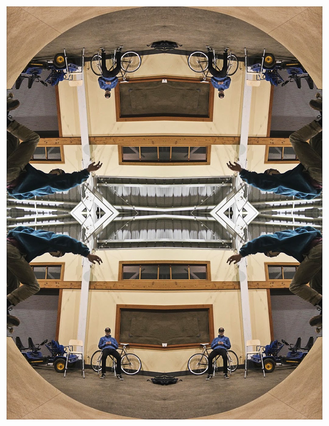
Warehouse
This is a kaleidoscope of the half pipe that we built at my friends warehouse. I liked this photo because it turned the half-pipe into a full pipe. It is different than the other kaleidoscopes because it is a square. The half-pipe natural makes a circular shape on its own.